A client had requested we complete a shoot with more of a lifestyle focus than the usual almost-empty kitchens we photograph. Therefore for this project, we hired a group of fantastic models to help sell the idea. The subject was a beautiful traditionally designed shaker kitchen with blue cabinets and bespoke furniture.
A Traditional Kitchen with Clean, Neutral Colour
This kitchen, photographed for a client, had clean colours and traditional lines. The stainless handles and distressed, mirrored splashback gave it a more contemporary edge whilst still fitting the properties charm and character.
Thank you for reading! I hope you enjoyed this blog post, stay tuned for more content like this. Consider subscribing to the blog using the form below.
Recent Posts
Classic yet Rustic Interior Design at an Edwardian Villa in Yorkshire
Great Furniture Makes For A Great Workplace
A Cozy Kitchen With Character
A Little Staging Can Go A Long Way! Photographing A Contemporary Apartment In Leeds
I was recently approached by Mason & Vaughan Group in Manchester to shoot one of their apartments over here in Leeds. They wanted something a little above the usual as they were getting an interior designer (Michelle Mansfield) in to stage the property beforehand.
The only things that were in the apartment prior to this arrangement were 2 black sofa's and nothing else. These can be seen in the below image. The rest of the apartment was very neutral and an empty carcass. As you can see from the below images, the additional touches Michelle made to the apartment really brought it to life. Granted, she brought in multiple pieces of furniture, but this was an extreme case. In most property sales you could get away with the little touches that really bring it to life.
Adding throw's to sofa's and bed's, books to side tables, flowers, setting the table and other accessories is what makes this. It looks lived in, but also very neat and together. Each piece fits together in the design of the room, while making the room look more attractive, warm and inviting.
This helps the potential buyer picture themselves in the home and gives them ideas as to what the home can do for them. It also makes the images stand out on the listing and attract more interest.
It also makes for a fantastic subject to photograph, giving interest from a number of angles. This helped us capture the entire apartment without having any empty and uninteresting photographs.
What do you think? From zero to hero? Or a waste of time?
Shooting Modern Office Interior Design With A Twist in Stockton-on-Tees
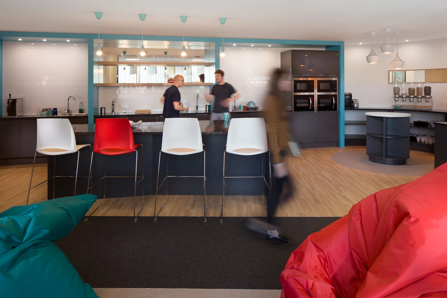
Back in October, I had the pleasure yet again, to work with one of my favourite clients, Dale Office Interiors, photographing a complete fit out they had finished just days before for rapidly expanding e-commerce experts Visualsoft. I had a really great time shooting this office, the interior design was bright and lively yet modern and functional, a great reflection of the warm and welcoming Visualsoft team. The design seemed a perfect fit for them, as the staff arrived for the day, you really feel a buzz about the place and I feel this design plays a big part in this.


A client had requested we complete a shoot with more of a lifestyle focus than the usual almost-empty kitchens we photograph. Therefore for this project, we hired a group of fantastic models to help sell the idea. The subject was a beautiful traditionally designed shaker kitchen with blue cabinets and bespoke furniture.